What Are The Spring Colours Explained Science Culture And Impact
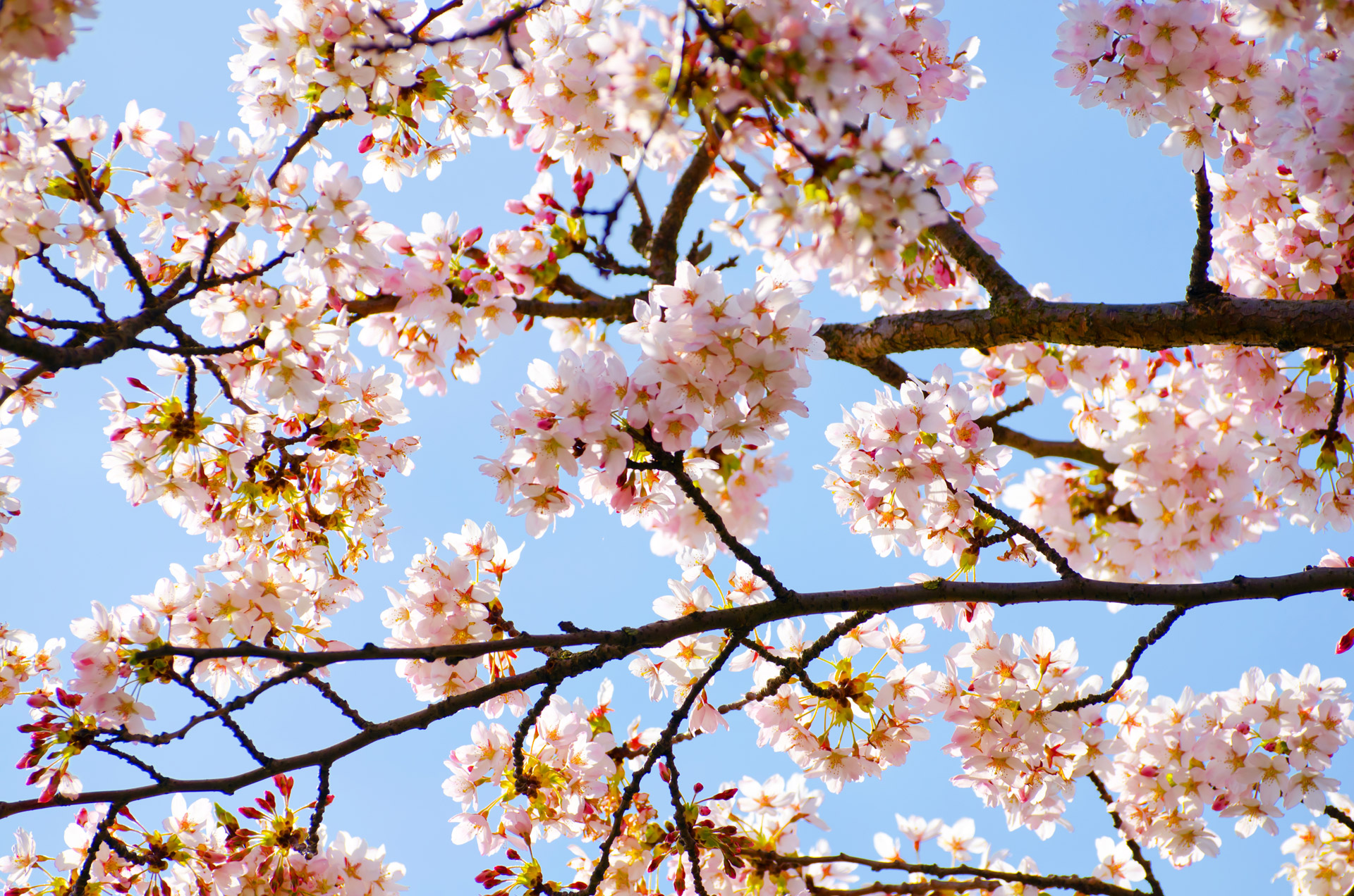
Spring’s vibrant palette transforms landscapes into a living canvas, where biological processes and cultural symbolism converge to create a seasonal spectacle. The emergence of pastel pinks, emerald greens, and golden yellows is not merely aesthetic—it reflects intricate chemical reactions in plants, ecological adaptations, and centuries of human interpretation. From the biochemical breakdown of chlorophyll in deciduous trees to the symbolic renewal celebrated in festivals and art, spring colors serve as a bridge between science and culture.
The study of these hues reveals deeper layers: how temperature and sunlight regulate their intensity, how pollinators rely on pigmentation for survival, and how societies have reimagined their meanings across time. Whether in the delicate petals of cherry blossoms or the bold strokes of Renaissance paintings, spring colors encapsulate nature’s resilience and humanity’s enduring fascination with renewal. This exploration examines their origins, ecological roles, and practical applications in design, offering a multidisciplinary lens to appreciate their significance.
Scientific Basis of Spring Colors in Plants
Spring colors in plants result from a complex interplay of biochemical processes, environmental stimuli, and seasonal adaptations. As temperatures rise and daylight increases, plants undergo physiological shifts that temporarily reduce chlorophyll dominance while enhancing or revealing secondary pigments. These changes are not random but are governed by photoperiodism, temperature-dependent enzyme activity, and resource allocation strategies. Understanding these mechanisms clarifies why certain plants exhibit vivid hues—from the yellows and oranges of carotenoids to the deep reds and purples of anthocyanins—while others retain green due to sustained chlorophyll synthesis.The transition to spring colors is primarily driven by the breakdown of chlorophyll and the unmasking or production of accessory pigments. In deciduous trees, this process is tightly regulated by hormonal signals (e.g., auxin and cytokinin gradients) and metabolic shifts triggered by warmer conditions. Below, the biological and chemical foundations of these phenomena are examined, followed by a comparative analysis of pigment distribution across species and the environmental factors modulating their expression.
Chlorophyll Reduction and Pigment Exposure in Deciduous Trees
Chlorophyll degradation in spring is a controlled process distinct from autumnal senescence, though both involve chlorophyllase and pheophorbide oxygenase enzymes. In deciduous trees, the reduction of chlorophyll begins as meristematic activity resumes, diverting resources from leaf maintenance to new growth. The enzyme chlorophyllase cleaves the phytol tail of chlorophyll a and b, converting them into colorless derivatives, while pheophorbide a oxygenase (PaO) oxidizes the porphyrin ring, accelerating pigment breakdown. This reduction exposes underlying carotenoids (e.g., lutein, violaxanthin, neoxanthin) and, in some species, triggers the synthesis of anthocyanins in response to light and temperature cues.The timing of chlorophyll loss varies by species and climate. For example, Betula papyrifera (paper birch) exhibits bright yellow spring foliage due to high carotenoid concentrations, while Acer rubrum (red maple) displays red-purple tones from anthocyanin accumulation in young leaves. The interaction between these pigments creates the spectrum of spring colors, with carotenoids providing yellow-orange hues and anthocyanins contributing red-purple shades. Below is a breakdown of the key biochemical pathways:
Chlorophyll Breakdown Pathway (Simplified):The efficiency of this pathway is influenced by temperature-dependent enzyme activity and light intensity, with optimal pigment exposure occurring at moderate spring temperatures (10–20°C). Extreme cold or heat can disrupt these processes, leading to muted or delayed coloration.
1. Chlorophyll a → Pheophorbide a (via Mg-dechelation)
2. Pheophorbide a → Primary fluorescent chlorophyll catabolite (PFCC) (via PaO)
3. PFCC undergoes further modification into non-fluorescent catabolites.
Carotenoid Exposure and Anthocyanin Synthesis
Carotenoids, a class of tetraterpenoid pigments, serve dual roles as light-harvesting accessories in photosynthesis and photoprotective agents against oxidative stress. In spring, the decline of chlorophyll allows carotenoids to become visually dominant, particularly in species where their concentration is naturally high. For instance, Ginkgo biloba and Taxus baccata (yew) exhibit golden-yellow spring foliage due to lutein and β-carotene accumulation. The intensity of carotenoid colors is further amplified by zeaxanthin and neoxanthin, which contribute to pale yellow and cream tones.Table of Contents
- Scientific Basis of Spring Colors in Plants
- Chlorophyll Reduction and Pigment Exposure in Deciduous Trees
- Carotenoid Exposure and Anthocyanin Synthesis
- Comparative Analysis of Spring Pigments in Common Plants
- Environmental Influences on Spring Color Intensity and Timing
- Cultural and Symbolic Representations of Spring Colors in Global Traditions
- Spring Colors in Art and Literature: A Cross-Cultural Analysis
- Historical and Modern Events Featuring Spring Colors as Symbolic Elements
- Eastern vs. Western Interpretations of Spring Colors: A Comparative Study
- Contemporary Branding and Design: Leveraging Spring Colors for Emotional Impact
- Ecological Impact of Spring Colors on Ecosystems
- Pollinator Attraction and Nectar Availability
- Food Chain Dependencies Triggered by Spring Blooms
- Primary Producers (Spring Blooms)
- Primary Consumers (Pollinators & Herbivores)
- Secondary Consumers (Insectivores & Omnivores)
- Tertiary Consumers (Apex Predators)
- Decomposers (Fungi & Detritivores)
- Role of Spring Colors in Plant Reproduction
- Disruption of Native Spring Color Cycles by Invasive Species
- Practical Applications: Using Spring Colors in Design and Photography
- Step-by-Step Guide for Photographers Capturing Spring Colors
- Incorporating Spring Colors in Seasonal Interior Design
- Mood Board Template for Fashion and Graphic Design
- Historical Shifts in Perceptions of Spring Colors
- Evolution of Spring Colors in European and Asian Art (15th–20th Century)
- Pigment Sources: Natural Dyes vs. Synthetic Innovations
- Timeline of Scientific Discoveries Explaining Spring Colors
- FAQ
- What will the spring colors for 2026 be?
- What are the spring colors for 2025?
- What are the typical spring color palettes?
- What are the spring colors?
- What are the spring color seasons?
- What are the spring-summer colors for 2026?
Anthocyanins, water-soluble flavonoids, are synthesized de novo in response to environmental stressors such as high light exposure, low temperatures, or nutrient limitations. Their production in spring is often linked to UV-B radiation and cold acclimation, where they act as sunscreens and antioxidants. Species like Prunus serrulata (cherry blossom) and Cornus florida (flowering dogwood) produce anthocyanins in young leaves and flowers, yielding shades of pink, magenta, and deep red. The synthesis pathway involves the phenylpropanoid pathway, where phenylalanine is converted to anthocyanidins (e.g., cyanidin, pelargonidin) via chalcone synthase and subsequent enzymatic modifications.
Key Anthocyanin Biosynthesis Enzymes:The accumulation of anthocyanins is also influenced by sugar availability and hormonal signals (e.g., abscisic acid). In some cases, such as Fagus sylvatica (European beech), anthocyanin production in spring leaves is associated with cold hardening, where pigments protect photosynthetic machinery during temperature fluctuations.
Chalcone synthase (CHS): Catalyzes the first committed step in flavonoid synthesis. Dihydroflavonol 4-reductase (DFR): Converts dihydroflavonols to leucoanthocyanidins. Anthocyanidin synthase (ANS): Oxidizes leucoanthocyanidins to anthocyanidins.
Comparative Analysis of Spring Pigments in Common Plants
The following table summarizes the dominant pigments and typical color variations observed in spring across selected plants. Pigment ratios and environmental interactions determine the final hue, with some species exhibiting multiple pigment classes simultaneously.| Scientific Name | Common Name | Dominant Pigments | Primary Spring Colors | Pigment Interaction Notes |
|---|---|---|---|---|
| Betula papyrifera | Paper Birch | Lutein, violaxanthin (carotenoids) | Bright yellow | Low anthocyanin presence; carotenoids dominate due to minimal chlorophyll masking. |
| Acer rubrum | Red Maple | Cyanidin-3-O-glucoside (anthocyanin), chlorophyll remnants | Red-purple (young leaves), green (mature leaves) | Anthocyanin synthesis peaks in cool spring temperatures; chlorophyll resynthesis occurs as leaves mature. |
| Magnolia grandiflora | Southern Magnolia | Lutein, neoxanthin (carotenoids), traces of anthocyanins | Yellow-green to coppery bronze | Carotenoid-rich but chlorophyll persists longer due to evergreen adaptation. |
| Prunus serrulata | Japanese Cherry | Pelargonidin (anthocyanin), cyanidin | Pink, white, or deep red (flowers); green-yellow (leaves) | Floral anthocyanins attract pollinators; leaf pigments vary with cultivar. |
| Fagus sylvatica | European Beech | Quercetin (flavonol), cyanidin (anthocyanin) | Bronze-red (young leaves), green (mature) | Anthocyanins act as UV filters; pigmentation fades as leaves harden. |
| Tulipa gesneriana | Tulip | Cyanidin, pelargonidin (anthocyanins), carotenoids (petal edges) | Red, yellow, purple, white | Anthocyanin distribution varies by cultivar; carotenoids enhance vibrancy in yellow varieties. |
Environmental Influences on Spring Color Intensity and Timing
Temperature, sunlight, and moisture are critical determinants of spring color expression, with regional climates dictating the onset, duration, and vibrancy of pigment display. Below are the key environmental interactions:Primary Environmental Factors:
1. Temperature: Optimal spring temperatures (10–20°C) accelerate chlorophyll degradation and anthocyanin synthesis. Below 5°C, enzymatic activity slows, delaying coloration, while above 25°C, pigment stability may decline.
2. Sunlight (Photoperiod): Longer daylight hours in spring trigger photomorphogenic responses, including anthocyanin production. UV-B radiation enhances anthocyanin accumulation in some species (e.g., Hydrangea macrophylla).
3. Moisture: Adequate soil moisture supports metabolic activity, while drought stress can induce anthocyanin synthesis as a
Cultural and Symbolic Representations of Spring Colors in Global Traditions
Spring colors—soft pastels of pink, green, and yellow—transcend their botanical origins to become potent symbols of renewal, hope, and cultural identity. Across civilizations, these hues are embedded in artistic expressions, seasonal rituals, and national narratives, reflecting deeper philosophical and emotional resonances. While Western traditions often associate spring with rebirth and fleeting beauty, Eastern cultures frequently link it to impermanence (mono no aware) and spiritual awakening. This section explores how spring colors manifest in art, literature, and folklore, their historical significance in global events, and their contemporary reinterpretation in design and branding.
Spring Colors in Art and Literature: A Cross-Cultural Analysis
Artistic and literary depictions of spring colors serve as mirrors to societal values, often contrasting transient beauty with enduring themes. In Japanese ukiyo-e prints, cherry blossoms (sakura) symbolize the ephemeral nature of life, a concept reinforced by poets like Matsuo Bashō, who wrote:"An ancient pond! A frog jumps in—sound of water. The moon comes out over the mountains." —Haiku by Bashō (17th century)Here, the pale pink of blossoms evokes melancholy (aware), while in European Renaissance paintings, spring colors like Veronese’s golden yellows (e.g., The Feast in the House of Levi) represented divine light and moral purity. Persian miniatures, such as those in Shahnameh, used vibrant tulip reds to depict paradise, aligning spring with paradisiacal abundance.Key contrasts in symbolism:
Eastern traditions: Spring colors often carry dual meanings—renewal (shunbun no hi in Japan) and impermanence (sakura festivals). Western traditions: Emphasize rebirth (e.g., Botticelli’s Primavera, 1482) and fertility (e.g., pagan spring equinox celebrations). Historical and Modern Events Featuring Spring Colors as Symbolic Elements
Spring colors have been instrumental in defining cultural milestones, from religious festivals to political movements. Below are structured examples of their symbolic roles:
- Renaissance and Baroque Era (14th–18th centuries)
- Italian Primavera Festivals: Processions in Florence used pastel greens and whites to honor Flora, goddess of spring, blending pagan and Christian traditions.
- Dutch Golden Age (17th century): Tulip mania (1637) saw red and yellow tulips as status symbols, later immortalized in Jan Brueghel the Elder’s floral still lifes, which encoded moral lessons (e.g., tulips as fleeting wealth).
- Easter in Christian Art: Eggs dyed in pastel pinks and blues (symbolizing resurrection) became central to medieval manuscripts (e.g., Lindisfarne Gospels, 8th century).
- 19th–20th Century: Nationalism and Identity
- Japanese Hanami Culture: The pink of cherry blossoms became a unifying national symbol post-Meiji Restoration (1868), used in propaganda to promote unity ("The Land of the Rising Sun" imagery).
- Tulip as Dutch National Emblem: After WWII, red tulips were adopted as symbols of resilience, featured in Keukenhof Gardens and Royal Dutch Shell’s branding.
- American Civil War (1861–1865): Yellow roses (Union) and bluebonnets (Confederate) represented regional spring flora, later co-opted in memorial gardens.
- Contemporary Symbolism (21st Century)
- Olympic Games: The 2020 Tokyo Olympics (held 2021) used sakura-inspired pink and white in uniforms and venues to evoke wabi-sabi (transient beauty).
- Climate Activism: Green and yellow (e.g., Extinction Rebellion banners) now symbolize ecological renewal, repurposing spring’s natural hues.
- K-Pop and Global Fashion: BTS’s Be More album cover (2020) featured pastel greens to convey growth amid global uncertainty, aligning with spring’s themes of resilience.
Eastern vs. Western Interpretations of Spring Colors: A Comparative Study
The symbolic weight of spring colors diverges sharply between Eastern and Western frameworks, reflecting underlying cosmologies.
Aspect Eastern Traditions (e.g., China, Japan, Korea) Western Traditions (e.g., Europe, Americas) Core Symbolism Impermanence and acceptance (mono no aware). Cherry blossoms (sakura) embody mujō (transience), while plum blossoms (white/pink) symbolize resilience in adversity ("The Three Friends of Winter" in Chinese art). Rebirth and divine order. Spring colors in Byzantine mosaics (e.g., Hagia Sophia) linked to Edenic light, while Renaissance allegories (e.g., Primavera) tied greenery to Venus’s influence. Seasonal Rituals
- Japan: Hanami festivals (8th century–present) feature pink lanterns and wagashi (pastel sweets) to honor ancestors.
- China: Qingming Festival (Tomb-Sweeping Day) uses willow greens to pay respects to the dead, blending spring renewal with ancestral ties.
- Europe: Maypole dances (pre-Christian) used ribbons in green/white to celebrate Beltane, later Christianized as St. Walpurga’s Day (green symbolizing fertility).
- Americas: Easter egg hunts (19th century) adopted pastel colors to symbolize Christ’s resurrection, merging pagan and religious traditions.
Artistic Techniques Minimalism and subtlety: Japanese sumi-e ink paintings use single-stroke cherry blossoms to convey ma (negative space), while Korean minhwa employs delicate yellows in folk patterns. Vibrant realism: Flemish still lifes (e.g., Peaceful Kingdom by Pieter Bruegel) layered red tulips and greens to create depth, emphasizing abundance. Modern Adaptations
- Design: Japanese wabi-sabi aesthetics (e.g., Muji’s pastel product lines) use off-white and muted greens to evoke tranquility.
- Fashion: Issey Miyake’s Pleats Please (2010s) incorporated sakura motifs in lightweight fabrics, blending technology with nature.
- Branding: Pantone’s Spring 2023 colors ("Peach Fuzz" and "Mellow Yellow") were marketed as optimistic and inclusive, aligning with Western ideals of progress.
- Interior Design: Scandinavian hygge spaces use soft greens and yellows to create warmth, contrasting Eastern minimalism with cozy maximalism.
Contemporary Branding and Design: Leveraging Spring Colors for Emotional Impact
Modern brands and designers strategically deploy spring colors to evoke specific emotional responses, often tying them to nostalgia, sustainability, or optimism. Below are case studies demonstrating their psychological and commercial applications:
- Sustainability and Nature
- Patagonia (Outdoor Apparel): Uses sage green and sunflower yellow in campaigns to associate products with ecological renewal, aligning with their 1% for the Planet initiative. The 2021 "Worn Wear" collection featured pastel blues to evoke "gentle reuse."
- Etsy (E-Commerce
Ecological Impact of Spring Colors on Ecosystems
Spring colors in flowering plants serve as critical ecological signals that synchronize blooming with pollinator activity, thereby sustaining biodiversity and trophic interactions. The pigmentation of flowers—ranging from ultraviolet (UV) to red spectra—evolves through natural selection to optimize reproductive success while simultaneously structuring food webs. These visual and chemical cues regulate pollinator behavior, influence seed dispersal, and shape predator-prey dynamics, creating cascading effects across ecosystems. Below, the mechanisms by which spring colors drive ecological processes are examined, including their role in pollinator attraction, food chain dependencies, and disruptions caused by invasive species.
Pollinator Attraction and Nectar Availability
Flower colors and nectar production are co-evolved traits that determine pollinator visitation rates, with pigmentation acting as a primary visual cue. Ultraviolet (UV) patterns, invisible to humans but detectable by bees and butterflies, often guide insects to nectar-rich flowers. For instance, Lavandula angustifolia (lavender) emits UV reflections that form "landing guides" for bees, increasing pollination efficiency by up to 30% compared to UV-neutral flowers (Chittka et al., 1994). Similarly, red and orange hues (e.g., in Papaver rhoeas or poppies) attract long-tongued bumblebees, while blue and purple (e.g., Echium vulgare) are favored by short-tongued bees and butterflies.Nectar availability is equally critical, as its sugar concentration and amino acid content influence pollinator energy intake. Spring ephemerals—plants like Trillium grandiflorum (white trillium)—produce high-sugar nectar early in the season when pollinators emerge from dormancy, ensuring their survival. Conversely, late-blooming species (e.g., Solidago or goldenrod) provide nectar later in spring, supporting migratory insects like monarch butterflies (Danaus plexippus). Disruptions in nectar production, such as those caused by climate shifts or pesticide use, can lead to pollinator declines, with cascading effects on seed set and plant diversity.
Food Chain Dependencies Triggered by Spring Blooms
The emergence of spring colors initiates a trophic cascade that links primary producers (plants) to apex predators (birds of prey). Below is a structured flowchart illustrating these dependencies:
Key Interactions:Primary Producers (Spring Blooms)
Flowering plants (e.g., Crocus vernus, Ficaria verna) provide nectar, pollen, and seeds.
Resource provision →
Primary Consumers (Pollinators & Herbivores)
- Bees (Apis mellifera, Bombus terrestris)
- Butterflies (Pieris rapae, Papilio machaon)
- Beetles (Cantharis spp.)
- Moths (Hyles euphorbiae)
Depend on nectar/pollen for energy and protein; some species (e.g., beetles) feed on petals or seeds.
Prey availability →
Secondary Consumers (Insectivores & Omnivores)
- Spiders (Araneus diadematus)
- Lizards (Lacerta vivipara)
- Birds (Erithacus rubecula, Fringilla coelebs)
- Bats (Pipistrellus pipistrellus)
Prey on pollinators or consume seeds dispersed by herbivores.
Energy transfer →
Tertiary Consumers (Apex Predators)
- Birds of prey (Buteo buteo)
- Snakes (Natrix natrix)
- Mammals (Mustela nivalis)
Regulate populations of secondary consumers, maintaining ecosystem balance.
Nutrient cycling →
Decomposers (Fungi & Detritivores)
Break down organic matter from dead plants/insects, enriching soil for new blooms.
- Mutualism: Bees and flowers co-evolve; bees receive food, while flowers achieve cross-pollination.
- Parasitism: Cuckoo bumblebees (Bombus bohemicus) exploit host nests, reducing native pollinator populations.
- Keystone Species: Early-blooming Primula vulgaris (primrose) supports migratory insects, acting as a "pulse" in the food web.
Role of Spring Colors in Plant Reproduction
Flower pigmentation functions as a species-specific attractant or deterrent, optimizing reproductive success through:
1. Pollinator Targeting:
- Bright colors (red, yellow): Attract long-distance pollinators (e.g., hummingbirds to Salvia species).
- UV patterns: Guide bees to hidden nectar (e.g., Delphinium flowers).
- White/light colors: Reflect UV, signaling night-blooming moths (e.g., Oenothera or evening primrose).
2. Chemical Synergy:
- Pigments + scent: Lilium species combine red hues with volatile compounds to attract specific beetle pollinators.
- Nectar guides: Contrasting petal colors (e.g., blue centers in Viola violets) direct insects to reproductive organs.
3. Deceptive Strategies:
- Mimicry: Ophrys apifera (bee orchid) mimics female bee pheromones and appearance to lure male bees for pollination.
- Repellents: Some flowers (e.g., Arum maculatum) use dark purple/black colors to deter nectar robbers like ants.
Evolutionary Trade-offs:
- Energy allocation: Brightly colored flowers require more photosynthetic resources; trade-offs exist between pigment production and seed viability.
- Environmental filters: In shaded forests, white or pale flowers (e.g., Anemone nemorosa) dominate, as light conditions limit pigment synthesis.
Disruption of Native Spring Color Cycles by Invasive Species
Invasive plants alter native pollinator networks by:
- Dominating floral resources: Alliaria petiolata (garlic mustard) in North American forests outcompetes Trillium species, reducing native bee visitation by 40% (Memmott et al., 2007).
- Shifting phenology: Hedera helix (English ivy) blooms in late autumn, desynchronizing pollinators from native spring blooms (e.g., Rhododendron in the UK).
- Altering color spectra: Lonicera maackii (Amur honeysuckle) produces tubular flowers with UV patterns that attract bumblebees away from native Asclepias milkweeds, threatening monarch butterfly larvae.
Case Study: Mediterranean Basin
- Invasive: Acacia dealbata (silver wattle) from Australia disrupts native Erica heathland ecosystems in Portugal.
- Mechanism: Early spring blooms (September–November) coincide with peak activity of Xylocopa carpenter bees, which then fail to pollinate native Cistus species.
- Impact: Reduced seed set in
Practical Applications: Using Spring Colors in Design and Photography
Spring colors—ranging from vibrant greens and soft pastels to bold yellows and delicate pinks—offer dynamic creative opportunities across disciplines. Their visual appeal transcends aesthetics, influencing emotional responses, ecological storytelling, and functional design. This section explores structured methodologies for leveraging spring hues in photography, interior design, fashion, and digital interfaces, grounded in technical precision and psychological impact.
Step-by-Step Guide for Photographers Capturing Spring Colors
Photographers can maximize the vibrancy and depth of spring colors by aligning technical settings with natural phenomena and seasonal light dynamics. The following steps integrate optimal lighting conditions, composition techniques, and post-processing strategies to achieve professional results.
- Preparation and Scouting Locations
Spring colors vary by region and bloom cycles; research local flora (e.g., cherry blossoms peak in late April in Japan, while daffodils thrive in early March in Europe). Prioritize locations with contrasting textures—such as moss-covered trees against blooming magnolias—to enhance depth. Use tools like bloom calendars (e.g., National Geographic’s Plant Guide) to predict peak color phases.- Optimal Lighting Conditions
Capture images during the golden hours (one hour after sunrise or before sunset) to exploit soft, diffused light that minimizes harsh shadows and accentuates pastel tones. Overcast days enhance saturation in cool spring colors (e.g., lavender, mint) by reducing glare, while direct sunlight intensifies warm hues (e.g., mustard yellow, coral). Avoid midday light, which can wash out delicate petals or create unnatural contrasts.- Camera Settings for Color Accuracy
Use a color temperature of 5000–5500K (daylight or shade mode) to prevent color casts. Shoot in RAW format to retain dynamic range for post-processing adjustments. For macro photography of flowers, employ a small aperture (f/8–f/11) to ensure sharpness across the entire frame, while wider apertures (f/2.8) create bokeh effects for isolating subjects against blurred backgrounds.- Composition Techniques
Apply the rule of thirds to place focal points (e.g., a single tulip) at intersections for balance. Incorporate leading lines (e.g., winding paths through meadows) to guide the viewer’s eye through layered spring scenes. For symmetry, use reflections in water or mirror-like surfaces (e.g., puddles after rain) to amplify color harmony.- Editing for Enhanced Spring Aesthetics
In post-processing, use selective color grading to emphasize primary hues:
- Warm palettes (peach, gold, terracotta): Increase exposure by +10% and boost saturation in the yellow and red channels.
- Cool palettes (lilac, sage, aqua): Apply a slight teal tint (HSL adjustment: -5% cyan, +3% blue) to mimic natural light conditions.
Use dodge and burn tools to highlight edges of petals or foliage, and apply a subtle vignette to draw attention to the center of the image.- Equipment Recommendations
- Lenses: 24–70mm zoom for versatility, 100mm macro for close-ups.
- Filters: Polarizing filters reduce glare on leaves, while graduated ND filters balance exposure in high-contrast scenes (e.g., bright sky vs. shadowed forest floor).
- Tripods: Essential for long exposures in low-light conditions (e.g., capturing misty dawns in cherry blossom tunnels).
Note: For black-and-white conversions, prioritize contrast in textures (e.g., rough bark vs. smooth petals) over color loss, as spring’s monochromatic tones rely on tonal variation to evoke seasonality.Incorporating Spring Colors in Seasonal Interior Design
Interior designers leverage spring colors to create spaces that evoke renewal, energy, and tranquility, aligning with psychological principles of chromotherapy. The choice between warm and cool palettes influences mood, spatial perception, and functional use of color. Below is a comparative analysis of their applications and effects, alongside practical decor strategies.
Aspect Warm Spring Palette (Peach, Coral, Mustard, Olive Green) Cool Spring Palette (Lavender, Mint, Lilac, Soft Blue) Psychological Effects Stimulates warmth, sociability, and creativity. Ideal for communal spaces (e.g., kitchens, living rooms) to encourage interaction.
- Increases perceived temperature in colder climates, creating a cozy ambiance.
- Associated with energy and optimism, reducing winter fatigue.
Promotes calmness, clarity, and relaxation. Suited for bedrooms, home offices, or meditation rooms.
- Lowers stress levels by mimicking natural spring light.
- Enhances focus and productivity in workspaces.
Design Applications
- Accent walls in terracotta or warm yellow to add depth to neutral-toned rooms.
- Textiles: Velvet or linen curtains in golden ochre or burnt sienna for tactile contrast.
- Furniture: Mid-century modern pieces in walnut or teak paired with mustard-yellow cushions.
- Decor: Ceramic vases in rust or copper tones with dried botanicals (e.g., eucalyptus).
- Ceiling treatments in pale blue or misty gray to create an airy, expansive feel.
- Textiles: Linen or cotton bedding in mint or lavender for breathability.
- Furniture: Light wood finishes (e.g., ash or birch) with silver or pale gray metal accents.
- Decor: Glassware in seafoam green or translucent aqua to reflect light.
Lighting Strategies Warm-toned LED bulbs (2700K–3000K) enhance the palette’s coziness. Use table lamps with amber shades to concentrate light on focal points (e.g., a peach-colored armchair). Cool-white LED bulbs (4000K–4500K) maintain color accuracy. Opt for suspended globes in frosted glass to diffuse light evenly, avoiding harsh reflections on cool surfaces. Natural Elements Integration Incorporate woven baskets, rattan furniture, or stone planters to ground the palette’s warmth with earthy textures. Use water features (e.g., indoor fountains), smooth river stones, or glass terrariums to amplify the palette’s serene, fluid qualities. Design Tip: For transitional spaces (e.g., hallways), use bi-color schemes (e.g., coral walls with mint trim) to bridge warm and cool tones while maintaining visual harmony.Mood Board Template for Fashion and Graphic Design
Mood boards synthesize spring colors with textures, patterns, and materials to inspire cohesive collections or visual identities. Below is a structured template combining color palettes with tactile elements, formatted for adaptability in fashion sketches or digital design projects.
Color Palette Foundation:
- Primary: Soft buttercup (#F4D03F), dusty rose (#D4A5A5), sage green (#8A9B68).
- Secondary: Slate blue (#6D8B97), warm taupe (#A58B6F), pale lemon (#FFF44
Historical Shifts in Perceptions of Spring Colors
The representation and interpretation of spring colors in art have evolved significantly across centuries, reflecting broader scientific, technological, and cultural transformations. European and Asian artistic traditions demonstrate distinct trajectories in how pigments were sourced, applied, and symbolically interpreted, particularly from the 15th to the 20th century. These shifts were driven by advancements in pigment chemistry, industrialization, and environmental observations, reshaping aesthetic preferences and even ecological narratives. The interplay between natural dyes and synthetic alternatives further underscored the relationship between human innovation and the natural world’s chromatic palette.The transition from handcrafted pigments to mass-produced dyes marked a pivotal era, where accessibility and standardization altered artistic conventions. Concurrently, scientific discoveries elucidated the biological and chemical foundations of spring colors, influencing both artistic techniques and cultural symbolism. Below, the evolution of spring color perceptions is examined through artistic trends, pigment innovations, and the emerging impact of climate change on future chromatic patterns.
Evolution of Spring Colors in European and Asian Art (15th–20th Century)
European and Asian art traditions developed divergent yet interconnected approaches to depicting spring colors, shaped by regional availability of materials and cultural symbolism.European Art: From Naturalism to Symbolism
During the Renaissance (15th–16th centuries), European artists relied on natural pigments derived from minerals, plants, and insects. For instance:
- Ultramarine blue (from lapis lazuli) and vermilion (mercury sulfide) were prized for their vibrancy but were prohibitively expensive, reserved for divine or elite subjects.
- Spring greens were often rendered using malachite or copper acetate, while yellows came from saffron or lead-tin yellow.
- The Northern Renaissance emphasized botanical accuracy, as seen in Albrecht Dürer’s Great Piece of Turf (1503), where delicate spring foliage was meticulously observed.
By the 18th and 19th centuries, the Romantic movement idealized spring as a symbol of renewal and melancholy, with artists like Caspar David Friedrich using muted, atmospheric tones to evoke fleeting natural beauty. The Impressionists (late 19th century) revolutionized color theory, employing synthetic pigments such as cobalt blue and chrome yellow to capture light and seasonal transitions with unprecedented brightness.
Asian Art: Symbolism and Harmonious Palettes
In East Asian traditions, spring colors carried philosophical and seasonal associations:
- Chinese ink painting (Song Dynasty, 10th–13th centuries) used monochromatic greens and blues to symbolize harmony with nature, often depicting plum blossoms (meihua) and cherry blossoms (yingtao) as harbingers of renewal.
- Japanese ukiyo-e prints (Edo period, 17th–19th centuries) featured vibrant pinks and whites for sakura (cherry blossoms), reflecting the mono no aware (pathos of transience) aesthetic.
- Indian miniature paintings (Mughal era, 16th–18th centuries) incorporated indigo, turmeric, and saffron to depict spring festivals like Holi, where colors symbolized divine play (lila).
The Meiji Restoration (late 19th century) introduced Western synthetic pigments to Japan, leading to a fusion of traditional motifs with European techniques. By the 20th century, Japanese woodblock prints and Chinese oil paintings adopted brighter palettes, reflecting globalization’s influence on artistic materials.
Pigment Sources: Natural Dyes vs. Synthetic Innovations
The shift from natural to synthetic pigments fundamentally altered the production, cost, and cultural significance of spring colors.Natural Pigments: Limited but Symbolically Rich
Before the 19th century, pigments were extracted from:
- Plants: Woad (blue), madder (red), turmeric (yellow), and indigo required labor-intensive processes and were regionally specific.
- Minerals: Lapis lazuli (blue), ochre (earth tones), and malachite (green) were mined and ground into powders.
- Animal/Insect Sources: Tyrian purple (from murex snails) and carmine (cochineal insects) were rare and costly, often used in royal or religious contexts.
Synthetic Pigments: The Industrial Revolution’s Impact
The 18th and 19th centuries witnessed breakthroughs that democratized color:
- 1704: Lead chromate (chrome yellow) was synthesized, offering a stable alternative to toxic arsenic-based yellows.
- 1807: Prussian blue (iron ferrocyanide) replaced expensive lapis lazuli.
- 1856: William Perkins’ aniline dyes enabled the first synthetic purples and pinks, revolutionizing textiles and art.
- Late 19th century: Phthalocyanine blues and greens (1935) provided lightfast, vibrant hues for modernist art.
Cultural and Artistic Consequences
- Accessibility: Synthetic dyes reduced costs, allowing middle-class artists and consumers to use previously elite colors.
- Brightness and Durability: Impressionists and Post-Impressionists exploited new pigments to achieve luminosity, as seen in Vincent van Gogh’s Sunflowers (1888), where chrome yellow and cobalt blue created vivid contrasts.
- Decline of Traditional Techniques: Handcrafted dyeing (e.g., Japanese aizome indigo dyeing) persisted in niche markets but lost dominance to industrial production.
Timeline of Scientific Discoveries Explaining Spring Colors
Major scientific advancements demystified the biological and chemical mechanisms behind spring colors, influencing both art and ecology.
Year Discovery/Development Impact on Spring Color Perception 1671–1676 Antonie van Leeuwenhoek observes chloroplasts in plant cells (early microscopy). Layed groundwork for understanding photosynthesis, though chlorophyll’s role in green pigmentation was not yet identified. 1772 Joseph Priestley discovers oxygen, a precursor to photosynthesis research. Enabled later studies on how plants convert light into energy, indirectly explaining leaf greening in spring. 1817 Thomas Pelletier and Joseph Caventou isolate quinine and later indigo dye from plants, advancing pigment chemistry. Demonstrated that plant-derived colors could be chemically extracted, influencing synthetic dye development. 1842 Justus von Liebig publishes Organic Chemistry in Its Applications to Agriculture and Physiology, linking plant pigments to nutrition. Connected chlorophyll to plant health and seasonal growth, influencing agricultural and artistic depictions of spring. 1864 Gregor Mendel establishes laws of inheritance, including traits like flower color. Explained genetic variation in plant pigmentation, relevant to selective breeding of colorful spring blooms (e.g., tulips, roses). 1880s Wilhelm Ostwald develops color theory, classifying pigments by hue, saturation, and brightness. Provided a scientific framework for artists to harmonize spring colors, as seen in Pointillism and Fauvism. 1913 Richard Willstätter isolates and synthesizes chlorophyll, elucidating its structure. Confirmed the molecular basis of green pigmentation, influencing botanical illustrations and ecological studies. 1935 Phthalocyanine pigments (copper-based blues/greens) are patented, offering stable, vibrant hues. Enabled modernist and abstract artists to use intense spring colors without fading (e.g., Mark Rothko’s works). Spring colors are more than fleeting visual delights—they are a testament to nature’s precision and human creativity. Scientifically, they illustrate the delicate balance of pigments and environmental triggers that sustain ecosystems, while culturally, they embody themes of rebirth, hope, and artistic expression. From the precision of a photographer’s lens to the strategic use of pastel palettes in modern design, their influence extends beyond seasons, shaping how we perceive freshness, vitality, and even digital experiences. As climate change reshapes these cycles, understanding their mechanisms becomes vital for preserving both ecological harmony and cultural heritage. Ultimately, spring colors remind us that beauty is deeply intertwined with function, history, and the enduring dialogue between life and art.FAQ
What will the spring colors for 2026 be?
Spring 2026 color trends aren’t yet confirmed, but Pantone and other authorities often predict soft, nature-inspired palettes like muted greens, warm terracottas, and delicate lavenders. Past trends suggest earthy tones with a touch of brightness, but exact forecasts require official announcements closer to 2025. Brands like Sherwin-Williams or Benjamin Moore typically reveal seasonal palettes in late 2025.
What are the spring colors for 2025?
Spring 2025 trends include Pantone’s "Rise of the Moon" (a soft pink) and earthy tones like sage green, warm clay, and buttery yellow. Sherwin-Williams’ "Spicy Hue" palette features spiced orange and deep teal, while Benjamin Moore highlights "First Light" (a pale gray-blue). Nature-inspired neutrals with subtle pops of color dominate.
What are the typical spring color palettes?
Spring palettes often blend fresh, vibrant hues with soft neutrals, like mint green, coral, sky blue, and blush pink. Earthy tones (sage, terracotta) and bright whites or creams balance the look. Pastels and floral-inspired shades are also common, reflecting renewal and outdoor themes.
What are the spring colors?
Spring colors usually include bright, uplifting shades like lemon yellow, peach, lavender, and soft green, alongside neutral bases like beige and taupe. These hues mimic blooming flowers, fresh foliage, and sunny skies. Muted or saturated versions may appear depending on the year’s trend direction.
What are the spring color seasons?
"Spring color seasons" typically refer to fashion or design trends split into Spring 1 (early spring) and Spring 2 (late spring), with the latter often introducing bolder or warmer tones. For example, Spring 1 might favor pastels, while Spring 2 leans into deeper greens or corals. Interior brands like Farrow & Ball also use seasonal collections (e.g., "Spring 2025" vs. "Summer 2025").
What are the spring-summer colors for 2026?
Spring-Summer 2026 trends aren’t finalized, but early indicators suggest a mix of vibrant terracotta, electric blue, and muted olive, alongside metallic accents like gold or bronze. Past transitions (e.g., 2025’s "Peach Fuzz" to "Blue Moon") hint at a shift from soft spring tones to richer, sun-drenched summer shades. Official palettes will likely be announced in late 2025.
Leave a Comment
Comments are moderated before appearing. The data you submit is processed according to the Privacy Policy of Velirium.